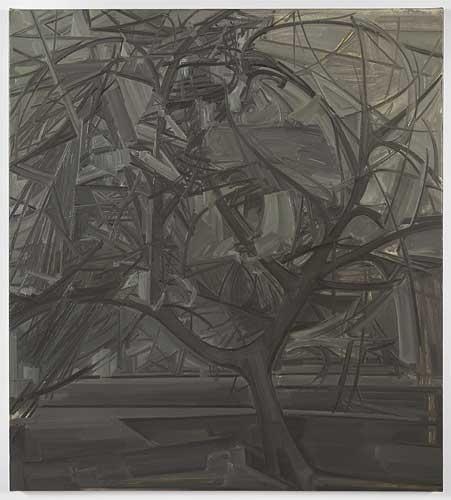
Gillian Carnegie
January 29 – March 5, 2011
Main Gallery
Dear Gillian,
As far as the colour involved in the work is concerned I must say that I disagree with some of the notes you sent me. I don't see the "subfusc" palette as locating a line from the baroque through to impressionism. Europe doesn't have to be aesthetically oriented toward the Mediterranean. I was suggesting that the slightly over mixed colours within the works have a muted tone which emerges from a particular situation that has little relation to such a Mediterranean scheme. By coincidence I was reading Rodenbach's criticism of Khnopff and there is a suggestion, especially in Hammershøi's case, that he instinctively writes about the muted tonality of the paintings as converging psychological interiority with the depicted architecture until they form a necessary equilibrium. Of course I want to see this in his writing but I do sense something different in the Belgian critic's notes on colour than many other writings from the era which seem seduced by southern flourish, ornament, the painting schools of the renaissance and the models of teaching they produce in order to influence others. And so we start with an initial disagreement.
You still haven't seen the Hammershøi painting in London yet have you? I admit I wanted to continue talking about Hammershøi but briefly wanted to show you some paintings by Pieter Saenredam who I think is the earliest example of this muted colour. Perhaps it is where the emotional tone of these converging colours originates. I would like that to be true. You will see depictions of interiors, figures as 'afterthought', structurally painted architectural repetition. It stands to reason that any consensus in Europe, over such great distances and periods in time was consolidated through these buildings. Much of the architecture from Saenredam's time acted as a bond between differing ideas but this was not the case in Northern Europe. There, in Saenredam's Delft paintings you have architecture as a mask disguising the schisms of the northern post-reformation appetite for ever dividing communions. I think these paintings really help in situating the origin of this muted colour. You get the feeling that colour is made mute in order to allow the obsessive attention to details, the first graphic baby steps of iconoclasm. I thought you would like the painting a lot as it appears worryingly bland, cold, dispassionate and stubbornly mute. I see no earlier example of such self-proclaiming understatement or lack of incident but it really explodes in the paintings of the Neue Sachlichkeit centuries after.
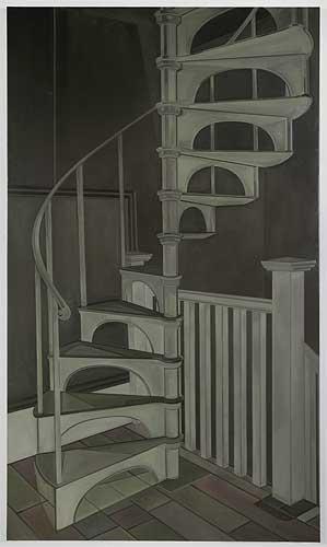
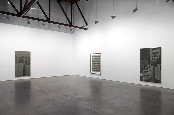
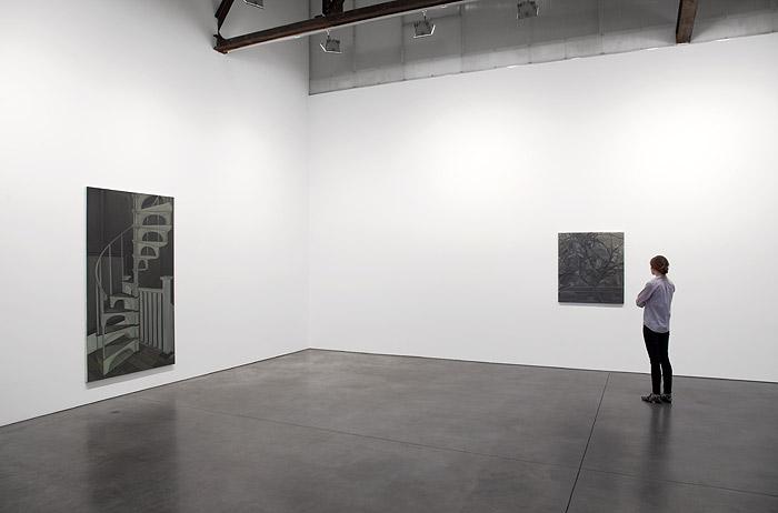
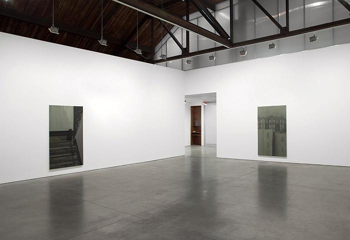
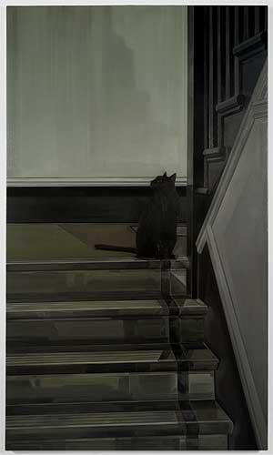
I see that you are painting the stairway to the roof of the apartments. God it's hard to walk up! I think it was made for an entirely different type of person than me (please read here "I can't believe this wasn't designed just for myself). Ascending, my foot looks a lot bigger when it's on those tiny iron steps and I feel slightly uncomfortable knowing that the entire building, with its surrounding estate, was intended for women only. Just that fact alone makes me feel displaced. Is that important to you when you paint a detail from within the building's interior? What I mean to say is that the dimensions of the building seem odd. Can the designers have really thought that women need a little less space than men? You said you wanted to paint the staircase as it is but somehow the experience of using it gets in the way of what I imagined writing about it? I was wondering if you felt similarly when you came to paint it. I see it less by way of spartan verisimilitude and more through the ostentatious 'theatre' of its suggestion, its 'theatre of observation' against its 'theatre of imagination', less a 'theatre of the body and its instincts' and more the 'theatre of the soul'. It's all the 'formers' that interest me here and none of the 'latters'. The proximity to your reference material subdues what I had intended to write but this also has become quite useful in measuring what it is that your painting is capable of that the objects themselves are not. Again I find myself repeating the thought that between the two instances of experience and representation the best I can hope to suggest is that there is no consensus between the affirmation of the painting and its negation, namely the language contained in this writing.
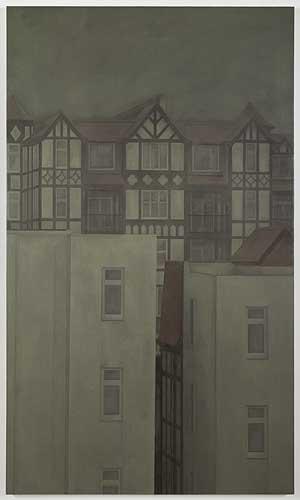
In Belgium I recently visited one of the many Béguinages and saw a line of trees which brought you to mind. Not only because of the trees but the Béguinage itself reminded me very much of the place where you live. I am not that interested in the spirituality of the women that inhabit this unique architecture but do enjoy the buildings which are described thus "due to a surplus of women occasioned by violence, war and military operations which took the lives of men, women had no option but to unite and secure economic aid". I read somewhere that the estate you live on is the only one of its kind in London. The Béguinages and the collective architecture of the estate where you live (I like that the housing is referred to as "The Tudor Cliffs" which I see you have painted also) was set up for woman who wished to have a place of their own, the time and space of self-containment.
Autonomy… really? I see this idea mentioned in a previous note you sent me and it strikes me that to venture into this idea assigns the written relation of the text a limited function, one designed from outside the work by a writer perhaps? If a writer isn't cautious the vocabulary of autonomy merely furnishes, as a fact, what a person expects to see. I think of many things related to your depicted interiors, facades, the grounds of the surrounding houses but I'm uncertain about an aesthetic narrative, such as autonomy, that could structure a response to the depiction of the 'self-contained' interiors. Saying that, there is something I would like to continue from a conversation which we had inside your apartment where you suggested that there is a sense of withdrawal from the world that is used by you in order for this work to exist. I'm curious about the logic of such a withdrawal. Could it parallel the experience of self-sufficiency within the apartment you live in? Just because these issues were raised directly inside your apartment, just because these concerns arose between the both of us doesn't mean that we still don't set a division between the experience of the work and its intelligibility or, for that matter, between both of our differing opinions.
- Simon Thompson
Gillian Carnegie was born in 1971 and studied in London at Camberwell School of Art and at the Royal College of Art, where she was part of the highly regarded painting MA program. Most recently, her work has been featured in exhibitions at the Los Angeles Museum of Contemporary Art, Tate St. Ives,UK, Museum Morsbroich Leverkusen, Germany and Marres, Centre for Contemporary Culture, Maastricht, Netherlands. In 2005 she was shortlisted for Britain's prestigious Turner Prize.
For more information and images, please contact Jessica Eckert, j.eckert@rosengallery.com, or Renee Reyes, r.reyes@rosengallery.com.
